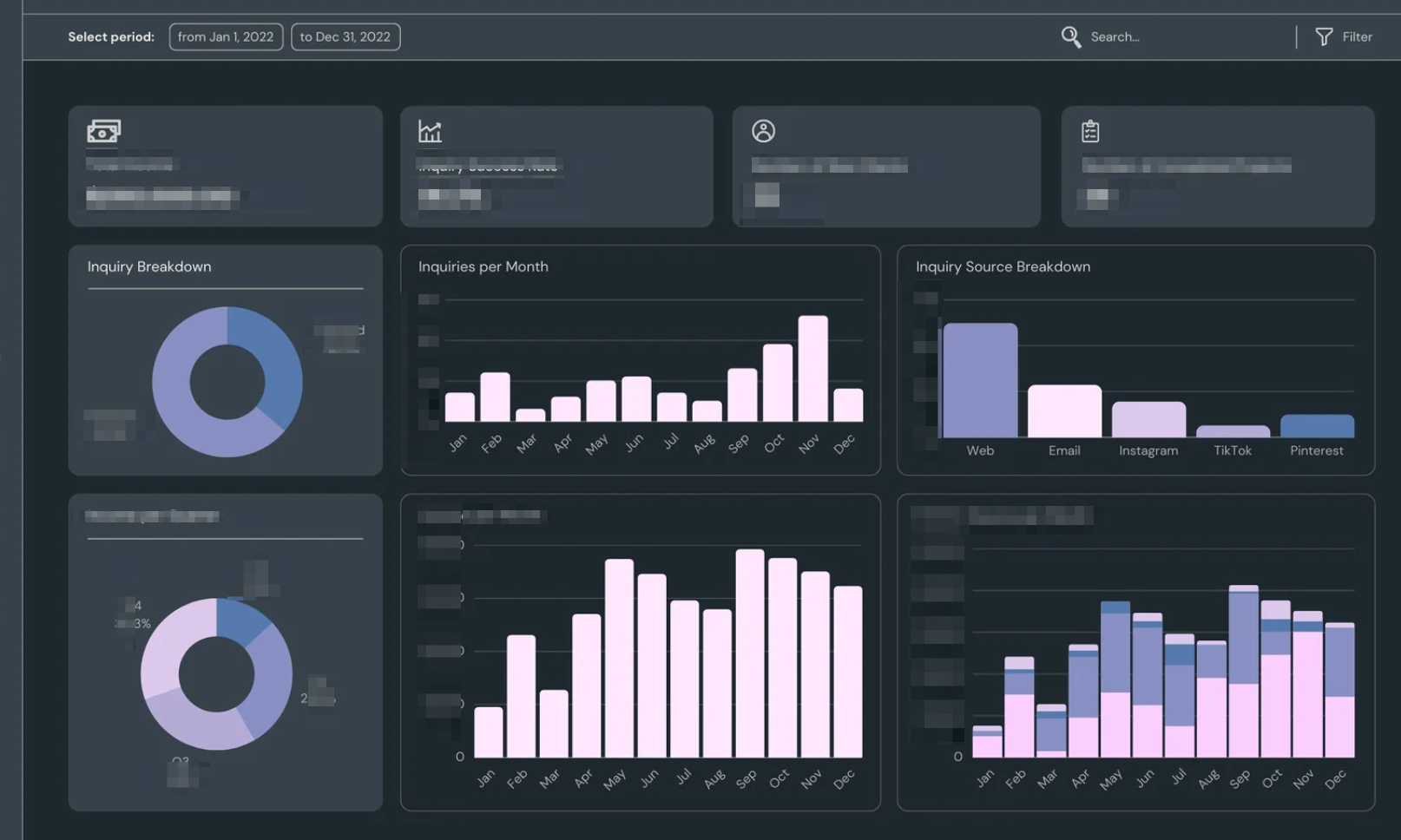
The PISA app draws data from a data microservice, prepares data for presentation, and produces an in- teractive data visualization application. The application displays flu data from country partners around the world to track flu transmission, seriousness, and impact.
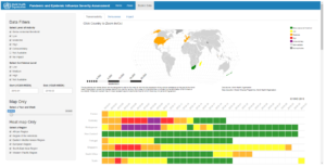
Features The data model allowed for relatively simple filters for users to drilldown to specific time pe- riods and regions. Thus, the data model allowed for time series and cross-sectional display in the app.
2
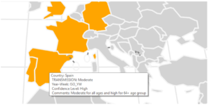
The User Interface (UI) was designed by Morton Analytics including various customizations to the flexdash- board menu bar and the development of static content. The PISA app included custom, web-based, D3 JavaScript graphics that provided an interactive experience with tooltips, map zoom/filter, and highlighting. For example, when you click on a country in the map to zoom, the heatmap below also filters to that country.
-Ryan Morton

